This chart shows the Case Shiller home price index in US Dollars and in grams of gold. Both indices use the price of a home in January, 2000 as 100. Prices in gold and dollars tracked pretty well until 2001, when the dollar began to collapse, taking the true value of homes down with it.
At first, the drop in the dollar simply offset the apparent rise in home prices, and prices in gold worked sideways until 2006. But when home prices began to fall in dollar terms, and dollars were themselves falling in value, the double-whammy pushed true home prices down to levels not seen since the late 1980s. In fact, they set a new record, the lowest level since the index was first published. This means that most homes purchased before 2010 are now worth less than the original purchase price, even if they show gains of 100%, 200%, or more, in dollar terms.
The next chart shows a synthetic index built from several different sets of home price data complied by Shiller for his book Irrational Exuberance. Looking back to 1890, we can see that home prices today are similar to those of the Great Depression, and not far above their all-time lows.
The final chart shows the median price of a new home in the US, both in dollars and gold grams. This is a log chart, necessary to encompass the huge increase in USD prices since the 1960s. Prices today (in gold) are about the same as they were in the 1980s, and far below their peaks in the 1960s and early 2000s.
Case-Shiller Home Price Index, Seasonally Adjusted
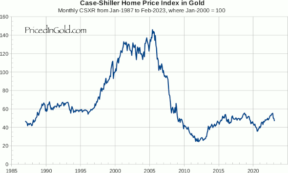
click on the chart to download a pdf
Shiller's Long Term Home Price Index
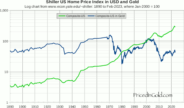
click on the chart to download a pdf

Pings on US Home Prices
Comments on US Home Prices
Greetings,
The USPS seems to be raising prices frequently. We have another one cent postage increase coming 5/12/08. Can you post a chart for US Postage priced-in-gold?
Ah homes. Everyone needs a place to live. Can you show rent vs. gold? And can you show a chart back to 1900? For those of us who still own our house, or portions of it, is it better to hold or sell at this point? How long until inflation catches up and effects house prices? A house is an asset and as such may be effected by the inevitable inflation. Also, population is not declining. The question is when real prices (priced in gold) will increase. Or, maybe someday houses will have a gold asking price? A historical chart, even including the 70s may be helpful.
thanks!
Additional comment. i think I may have answered my own question by looking at your gold vs DJIA chart. I would say USD in gold would stop rising (achieving parity if USD still exists) round about 2030- rising steadily for the next 20 years (if you use 1930-1980 pattern as precedent). After which case the real value of the stock market increases, feeding real real estate values. Though very rough it seems that real estate in gold price would begin to recover 2030-2040. How depressing really. In the meantime, at least we have a place to live (or our children/grandchildren do.) A chart from 1900ish showing DJIA, gold and property prices would be most illuminating. Many thanks.
Could you update the US Home Prices chart using Case Shiller data all the way back to 1890? The data is available at http://www.multpl.com/case-shiller-home-price-index-inflation-adjusted/table I'd love to see the historic data in terms of gold. Thanks for the great site.
@Michael Hendricks: Excellent idea, Michael! Thanks for the link to Shiller's long term data. I've added a chart going back to 1890 to this page. Fascinating to see just how low home prices really are!
This chart is a little skewed if you ask me. I live in Texas and granted we were in the oil boom but I bought my home for 73k in 1979. I can't remember but gold was around 500 at that time I guess. I believe i remember the price I paid was exactly the median for US home prices. If all those foggy memories are correct, the I paid in the neighborhood of 140 ounces for my home. That does not jive with the above chart very well. Now it's probably worth 75 ounces, so much for getting rich buying houses.
I guess this means gold is at an all-time high, when priced in US residential real estate.
One long term chart is worth more than one hundred opinions. The chart showing housing prices in gold since 1890 is fantastic, great work. It seems to stop in early 2011, I bet the next update will show that housing in gold terms is already cheaper than it has been in the entire 121 year chart! For me the choice is clear, while I understand the reasons for the demand for gold, for safety and income, I prefer bricks, dirt and tenants.
Great charts! I was wondering if something like this available for Canada? I would assume it would be very similar anyways, but I've been thinking about real estate investing and it could be helpful. Also, what is the average home price in gold ounces over the time frame of each chart? Thanks.
This is a fascinating article and concept. Housing prices are going to go up over time… no doubt about it. However, do they go up in value? When is it a good time to buy? Your graphs suggest to me that now is the best time to buy real estate since 1980, and I agree. Of course there will be some bumps in the road, but where will real estate values be in dollar terms and gold terms in 20 years?
Hi im a newbie just getting my head around this priced in gold thing. Wow what an inspiring concept….well a truism rather. Ok so all my years of thinking that money (paper notes) is value, and now appearing out of my ignorant and uneducated mind I need someone to get me up to speed please. Im in the UK…so do these comparisons ring true in respect to oil, silver etc in the UK…..not comparisons like US wages and US type things as that is inherent in the US only. So is this the case or would i need to follow up on UK comparisons?? Trouble is I cant find a UK priced in gold site. I may set one up myself if i manage to get this ingrained in my mind. Cheers Guy's. Andy – UK.
@Andy: I think you'll find that most commodities, like silver, oil, food, coffee, and so on, when priced in gold are pretty independent of your local fiat currency. Crude oil in my charts is based on West Texas prices, which are a bit lower than Brent, but both track up and down together tightly for the most part. In the early days, my chart showed both, but eventually I decided that the differences were small enough that it was better to have a cleaner chart with just one price.
I have all the data needed to create a GBP chart, and setting up Gilt price charts (maybe using INXG) and stock charts using FTSE 100 index would be pretty easy. In fact, you can easily chart the FTSE in gold using stockcharts.com, with the symbol "$FTSE:$GOLD". If you have a good source for historic UK home prices or other interesting series, I'd love to look at them.
Let me know if I can help.
Cheers,
Sir Charles
@Thomas Yonker: Agreed. Case-Shiller is an inflation-adjusted index — not actual USD. This chart is double-counting/double-adjusting. I still love this site though!
Actually, if read through the S&P Page describing the construction of the index, it is NOT inflation adjusted, but built of pairs of sale prices for the same homes. Ideally, one should use the gold-adjusted prices of the individual transactions to create the index, but I don't have access to the data for this… But I do think that the gold adjustment of the index as charted here is still very close to being an accurate reflection of how much gold homes in the index could be traded for at any given point in time. There is no double-adjusting.
@editor: It may not be "inflation adjusted" but it is standardized in a constant year 2000 baseline. Your gold chart above shows that it takes 20 ounces of gold to buy a house today (same as 1980). Problem is, the DOLLAR median price of a new single family home in september 1980 was $63,000 and it was 213,000 last september (2011). So, if the price of gold in september of 1980 was $666/oz, and it was ~$1650 last september… then the respective prices in gold are: 102 ounces in 1980 versus 129 ounces today. While these median prices are for NEW homes sales, I highly doubt that existing homes (used in Shiller's data) are 80% cheaper than new homes. http://www.census.gov/const/uspricemon.pdf
Hi Chad, I think you are reading too much into the chart. Like the original CSXR, the CSXR in gold is an index, adjusted to 100 for Jan-2000. The current CSXR in USD is 146.61, meaning that the "typical home" represented by the index sells now for almost 1.5 times what it sold for in Jan-2000. The gold-based chart simply observes that the dollars obtained by selling a typical house today will buy only 25% of the gold that the sales price of a typical house in Jan-2000 would have bought at that time. Many (but not all) other things have also fallen in value compared to gold since 2000. I take this to mean that participants in the market are showing a preference for gold (which I consider to be the safest form of cash) over these other items. Falling prices are caused by many forces in an economy with a relatively stable money (gold) supply, including increased productivity, better transportation, technology increasing yields, etc. Housing prices in particular reflect an over abundance of supply, and a demographic shift away from the kind of houses we have way too many of. I think that a strong preference for holding cash (gold) also makes a lot of sense given the behavior of governments and central banks all over the world. We live in an era of deflation, even though prices quoted in fiat currencies keep rising.
Interesting data. So here is an observation I don't quite understand though. Does it matter if the home priced in gold is falling when 1) I have a loan in dollars not gold and 2) I also am paid in dollars not gold. In switching back and forth between this chart and the US wages chart it seems that when home prices go up wages go up and when home prices go down wages go down.
"I take this to mean that participants in the market are showing a preference for gold … over these other items." That statement might seem counter-intuitive since everybody needs a place to live, but not everybody needs a stash of gold. You have to remember that "participants in the market" includes central banks, which show a strong preference for gold over all other physical assets. In particular, central banks have no use for housing, but they do have a great need to store value in a fungible physical asset.
@editor If everything has fallen relative to gold, then how does it matter what the price of gold is…Assuming wages/commodity prices and house prices all fall and rise at the same time then why should we measure everything in gold? I think a better measure is a percentage of median income itself, wouldnt you agree?
@worldview The problem is wages and prices (in dollars) don't rise and fall at the same time. For example, over the last four years wages in dollars haven't increased much at all, while food and energy prices have increased in dollar terms by about 50%. If everyone was paid in gold, and everyone paid for stuff in gold, then the world economic system would be in MUCH better condition than it is now – partially because of the accuracy of the pricing information, and partially because people and governments would have a MUCH harder time over-leveraging than they do under a fiat currency system.
@Tedd,
I think what I wanted to imply is that the denominator to measure everything should be income itself and not necessarily the value of gold…I do agree that gold is more stable than other commodities as a unit of measure of most things, but it is the wage that helps people buy stuff. So probably wages are a better denominator….
@world view: Wages as a denominator would be as bad or worse than the USD as the denominator. The supply of labor is volatile. The supply of gold is essentially constant. Wages vary based on region, skill, and productivity. Pure Gold has an exact weight relative to the gravitational pull of Earth. The purpose of pricing goods and services in terms of a near-constant denominator should be obvious.
@world view: I agree that median wages as the denominator would make some interesting and useful graphs. One problem is that it's difficult to calculate median wages, so those data are updated infrequently.
Median wages are also subject to modeling and data collection errors from the BLS (just like unemployment and inflation numbers). That adds another complexity or point for manipulation/error. With gold, markets rapidly set an open, continuous price and bystanders can easily observe it.
This is a great resource, glad I came across it.
Rather sobering to see the above chart, showing house prices in effect as cheap today as they were during the 30's Depression.
Would you have a similar graph for UK house prices? That would be very interesting indeed.
Also, a chart showing the changes in electricity prices (in gold) in UK would be good.
This is an excellent resource.
I was wondering if you might produce a similar graph for UK house prices. Or would it be fair to say they are reasonably well correlated with US home price changes?
Wow, I love this website. Thanks for all the hard work.
The home index is a little difficult to figure since it is not in ounces of gold as your other pages are. I imagine this is because when we look at historical data people always have the dollars inflation adjusted, which is what this website eliminates since an ounce of gold is an ounce of gold.
Since the graphs above are a percentage based on January 2000 = 100, would I be correct with the following assumptions.
Average price US home in January 2000 = $119,600 (http://www.census.gov/hhes/www/housing/census/historic/values.html)
January 2000 price of gold = $284.32 average price per ounce (http://www.kitco.com/scripts/hist_charts/yearly_graphs.plx)
That should mean that the reference point 100 = (119,600/284.32) or 420.7 ounces of gold for the average house.
Would that carry over to the other ratios you show on the graph?
For example, it appears from the graph that houses in 1890 were about 50% or 210.4 ounces?
Or that houses now are about 23% or 96.8 ounces, which at $1650 per ounce would mean that the average price for housing now is $159,720?
Please correct me if I'm misunderstanding as it's hard to get a read on the Case/Shiller index since it's inflation adjusted and value weighted.
If it is possible could I get my free initial chart showing the 1890 to current housing index using ounces of gold instead of ratios?
Hi Clark, your interpretation correct… However the Case Shiller Index as published by S&P is NOT inflation adjusted. It uses pairs of sale prices of the same houses as its data set, and is segmented by market (city). The CSXR is a composite of the indices for 10 of the largest markets. The idea is that you can take the price of a house on a given date, divide it by the index on that date, then multiply it by the index on some other date, and get a rough estimate of the house’s price in the second date. This works for USD prices using the original CS index, and works for gold prices using the Priced in Gold index. For a house in one of the markets tracked by CS, if you send me the city, price paid and the date of the transaction, I would be happy to make a chart of the house value in gold for you going back as far as the Case Shiller series goes. The longer term US Home Price Index is also constructed from Shiller’s nominal home price index (pieced together from various sources), but rather than using a conventional CPI adjustment to create a “real” index as in Irrational Exuberance, I use a gold price adjustment. None of these indices tries to follow a median or average priced home; the median price might have changed significantly over the decades. They attempt to show the relative price changes for any house meeting their selection criteria. Let me know if you have more questions. Cheers, Sir Charles
Actually this chart does not really tell the whole story. The average US home has increased in square footage from about 800 sq ft in 1900 to 2700 sq ft today. So the price of a US home in 2013 is a much better bargain ( or worse investment) than this chart would let on.
It would be even more instructive to see the sq ft price of us home in gold for the past century to get the true picture.
why doesn't the house price chart get updated like the rest?
Sorry! Just updated it today. Thanks for the reminder!
I would like to see home prices from 1890 and earlier in ounces of gold, it's hard for my to understand what the Y axis means on these graphs.
I also like the idea of seeing home prices in grams/ sq foot, even if it has to be estimated.
This is so true that we can not simply go off RE prices. (USD) without accounting for $/sqft. Grams/sqft would be great to get a read on current trend.
I think the chart is quite useful as is. I'd just like to see more updates.
I would like to see the NY City Condo/Coop in $ vs. Gold and vs US mean House in $ price.
I know that my measly Street parking spot is worth $200000. and is self cleaning (city does it).
I’d be happy to put something together for you if you can point me to a downloadable price history for NYC Condo/Coops…
Would one be better off to sell the house, buy gold, and become a renter?
From a purely investment point of view, that certainly was the case from 2000-2013. Recently, home prices have had a bounce, but I suspect that they will eventually decline again. So to answer your question, I think you could take advantage of the current high home prices and low gold prices to become a renter and do quite well in the coming years.
Thank you Sir Charles, I really appreciate your long term charts. They make it so easy to cancel the current noise and get historical perspective on investments. Back in 2011, when most wouldn't touch real estate with a long pole, and gold was all the rage, your U.S. Home prices since 1890 chart was loudly screaming: "sell your investment gold and buy real estate". I found the chart and posted a comment back then. It proved to be a very smart move. That chart still says the same thing, just a little less loudly.
Hi … great information!!
Can you price Canadian home prices in Gold?
We keep hearing about how Canadian home prices are in a bubble (especially Toronto and Vancouver).
Andrew
Hi Andrew, I do have Canadian home price data. I'll see if I can whip it into shape and add a page for it to the site. Thanks for reminding me!
Charles,
Here is the link to a recent historic chart of the UK house prices to gold ratio as provided by Nick Laird of Sharelynx which might be of help to your readers. He also has a chart of UK house prices to silver on the same link.
http://www.sharelynx.com/chartstemp/USHLSPOG1.php
The charts illustrate similar real value opportunities to your US house price to gold chart.
PS Incidentally, I was working in Tokyo from the mid 1980s to 1990, and I was there when the Nikkei topped. So I can confirm from first hand experience that your excellent chart of the Nikkei to gold ratio does indeed serve as an accurate record of when to buy and sell the Nikkei in real value terms.
Thank you for a very comprehensive and useful website.
Hi Charles, love your site "It's Gold!" :)) I wanted ask you, besides US homes, and land, can you add a "global" real estate and land comparison? In addition, for Germany, Switzerland, UK, Canada, Australia. I would recommend Globalpropertyguide.com, they are the best site I found for real estate, perhaps you could collaborate with them? Kind regards
Not completely clear from perspective of- is RE a value investment buy or sell now, or better buy hold gold or sell gold for RE? Any thoughts?
Hi James! It's hard to say. I guess it comes down to whether the recent bottom (at the end of 2011) was a replay of late 1975 or a replay of early 1980. I am slightly inclined towards the 1975 scenario, but would be happy to be proven wrong. We are well below the historic average (78.2 vs today's 43.5), so over the next 20-30 years I expect residential real estate to do pretty as measured in gold. The question is, will we see new lows between now and then?
would love to see home prices in other countries (Australia, Hong Kong, Canada, Spain etc)
Hi Arsen, I do have some Canadian home price data, and I will try to put it into chart form. Can you please point me towards historical data series the other countries? Thanks, Sir Charles
@editor: I believe house prices are going to drop vs Gold.. I think we’re about to hit an all time historic low in US housing measured in Gold.
If we do head into a stagflationary environment like in the 1979s.
Just my opinion.
Wow, it looks like we're in another housing bubble!
In terms of gold, right now housing prices are similar to 2009 and 1987 and actually seem quite reasonable. But in dollars, the media is alarmed at the exorbitant prices people are paying for houses and the rapid price inflation over the past few years.
For historical context we just posted 8.5% year over year inflation for March and the Fed is set to increase funds rate by 50 basis points this week. Housing prices could very soon take a turn and head down (in terms of dollars).
I'm just writing this because its fun to read back on people's posts over the years and right now we seem to be at a significant inflection point.
Pricing housing in gold dispels the notion that housing is an investment that appreciates in real terms. If its a personal residence, you've actually bought a depreciating consumption good. Measuring goods in terms of the depreciating dollar obscures this fact of reality.
With real estate being seen as the constant, this is an illustration of the US Dollars erosion against gold!
A personal residence isn't a "depreciating consumption good". It's a shelter unless you plan to live under a bridge, so either you buy, or you pay rent to a landlord. In addition, for a typical family that doesn't have the funds or expertise to safely and regularly venture into the big investment world, their home is an excellent asset to own, a hedge against the decline of the currency, furthermore, if they leverage the purchase, it allows them to get a 100% percent hedge with an out-of-pocket as low as 5%, plus it gives you tax deductions. In the long term, it's the most accessible and used financial tool for families, and it works great for them as the huge net worth comparison charts between owners and renters of similar incomes, confirm.
@EMB: For a homeowner who purchases a home as a shelter, it is most certainly a depreciating consumption good. To qualify as an asset, it has to earn income, i.e. rent, from another party.
It is only in our irredeemable fiat currency regime that housing values can jump so much that a personal residence comes to be treated as if it were an income generating asset.
You might wanna update the first as it is now at an all time low. I just checked the Shiller index and it is at 293. Considering gold is at $2000/oz, the ratio would be something like 14.5, which is insane. I am wondering that since we are already at the bottom and we know that problems are just starting to unravel, where is the REAL bottom?
@EMB: Housing is indeed a "depreciating consumption good", as it is a "good" you "consume", and in real terms, it "depreciates".
You also need to eat food if you plan to live. But this doesn't mean that food isn't a depreciating consumption good. It still is! 🙂
A home "depreciates" because it is worth less in real terms over time, because of entropy, and because of the improving quality of new housing stock at the same real price over time.
A home is a "consumption good" because you consume it, deriving benefits from it as it wears over time—and because it is not a factor in some future production. Rather, it is enjoyed as a "good" in and of itself.
Yes it is true that if you use debt, AND your interest rate is lower than the rate of inflation, you can use a home to gain wealth over time. But if and when this occurs, it comes at the expense of savers, who are earning a rate of return less than inflation.
This turns saving and lending into a zero sum game that is corrosive to the economic system as a whole.
You also have to look at some additional data around net worth comparisons:
In addition to effectively being subsidized by savers, it could be that the kinds of people who purchase homes are the kinds of people who are more likely to accrue net worth.
Also, those who have a higher proportion of their assets in income-bearing investments don't need as high of a net worth to retire as those who have a higher proportion of their assets in an illiquid home.
The home owner needs to own the home, as WELL as income bearing assets to retire, or else they need to sell the home so that they can retire.
Bottom line is that if anyone gets rich over time from borrowing to own a home, it's clearly NOT that the home is increasing in real value, as we can see here. It's that they are receiving a subsidized wealth transfer from savers who are getting hosed by earning an interest rate lower than the real inflation rate.
(At least this is the case on average. There can be specific times in which one is able to buy at a low real price, and sell at a high real price. But this would be a specific case, and not what is borne out by looking at the average of home prices across time. On average, as often as someone buys low and sells high, someone else is buying high and selling low.)
We bought our house in June 2000. From memory it was $240k or 946 oz of gold. Today ( Oct 2024) it appraises over $1.3 mil or 490 oz of gold. Hmmm, something wrong.
Update the data! Update the data!
@Sam: Done! Thanks for the reminder!
@Justin C: re "because of the improving quality of new housing stock at the same real price over time."
No disparagement meant toward today's newer homes, but the wood used in today's homes is from young trees under 20 years old. Termites eat these up more readily.
The wood studs I recently tore out of my parents' home from the 1970s, was from probably 40-60yo trees… much denser darker wood with more tanins, more termite proof, harder, more durable. And if you go into urban cores, they used prime redwood for framing, which is even better and more durable than the normal douglas fir used in the 1970s…
So, similar to how most of today's mass market furniture is now cardboard / sawdust (MDF) / plastic, vs solid hardwoods and metals if you go back in time, I think we can agree that "new housing stock" is not 100% improved vs older housing stock. It's different, just like cars are different today. There are some pros, some cons.
Are they better? Depends who you ask, what you value, etc.
As for charts: it would be great to have access to custom calculators and dashboards showing the value of everything in whatever you want – gold, silver, coffee, houses of a particular region.. prob all doable w/ chatgpt