US Stocks reached their peak in 1999, and have clearly been in a bear market since 2001. From a high of 1400, they have fallen to the 280-290 level, a drop of 80%.
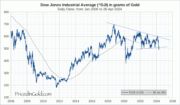
From 2003 through 2007, stocks appeared to perform well when priced in dollars, roughly doubling in value. Because virtually all of this gain was due to depreciation of the dollar, however, the gold price of the stocks actually declined slightly over the same period. During 2008 and early 2009, stocks gave up all of their gains since 2003 when measured in dollars. Priced in gold, they declined from about 800 grams to 220 grams, a 70% loss from 2003 levels.
Since the bottom in March of 2009, prices have risen strongly when measured in dollars, seen by many as proof that the recession is over and recovery has begun to take hold. Yet when priced in gold, we see that all of the "robust recovery" was the result of more dollar debasement, as trillions of dollars created by the Fed's "quantitative easing" and bailout programs flood into the market. In reality (aka priced in gold), stock prices have remained fairly flat from 2009 until July of 2011, when they began falling to levels well below their 2009 lows. Since then, they have been recovering, and in late 2025 are about where they were in late 2007.
DOW's Performance Since 1985

click on the chart to download a pdf
DOW's Performance Since 1900

click on the chart to download a pdf
Pings on Dow Jones Industrials
Comments on Dow Jones Industrials
I would love to see the TORONTO STOCK EXCHANGE priced in gold
@Andrew: Thanks for asking! That's a great idea. I've created a chart of the TSX with a comparison to the SPY, and I will update it going forward.
Hi, great site. Your charts are very interesting and helpful to get a better look at the big picture. One thought or question though… Is there a possibility, tool, service or something to apply some technical analysis indicators on your charts? I don't think they are available on yahoo, google, stockcharts or something like that. Any thoughts?
Thanx. Happy new year!
Hi Andrew! I wish I had better charting tools, too. I often download the PDF version, then print it out and mark it up with a pencil and straight edge. Old school, but it works! I'm looking into higher tech options… Stay tuned!
Great work with you gold valuation there. You present a completely different picture to the investor or anyone else interesting by the markets. Could please compare some of world's leading markets in gold please?
Hello,
What's your take on the first 2 charts in this article?
Is it possible that the gold run might be coming to an end …. and the DOW starting a new bull market?
http://www.wellenreiter-invest.de/WellenreiterWoche/Wellenreiter100522.htm
Certainly a different perspective. I was thinking about luxury items – it'd be interesting to see if they actually increase in value.
How about something like a 1921 Dom Perignon in gold?
I would love to see UK data priced in Gold, like housing, FTSE100 etc
@Sid:
Or maybe some Louis XIII?
Please show a chart comparing the price in gold to the price in dollars.
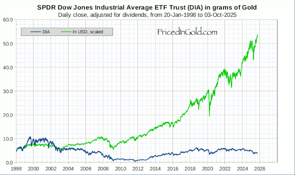
Hi Dave, thanks for the suggestion. I've been tracking the DIA index fund in USD and gold for some time, and I've added it to the page. Cheers, Sir Charles
@editor:– Please explain "scaled".– I would expect a second y-axis for the USD line.- Did you intentionally leave off the "gold grams" from the primary y-axis?What is SMA?
Hi Dave, by "scaled" I mean that the two graphs start at the same y-value, to show relative over and under performance. There is no separate labelled scale for USD. Perhaps it would be clearer if I showed the scale as % change, instead. SMA means "Simple Moving Average", in this case, a 200 day moving average. Hope this helps! Best, Sir Charles
Over the last few months, the chart since 1900 has become one of my favorites. I review it often. Would it be possible to publish a single median price for the entire time span? multpl.com shows a similar number for P/E ratios for the same date range. Thanks.
Thanks for the pointer, Michael! I've added an S&P 500 page to the site, and included some numbers for the PE10 or CAPE, calculated using gold as the deflator rather than the CPI. These suggest to me that we are starting to get into "cheap" territory, but are not out of the woods yet, by any means. Take a look, and let me know what you think.
Hello,
Could you show the NASDAQ and the RUSSELL 2000 priced in gold?
Hi Andrew! I do track the QQQ for my own use, though it isn't on the site. An easy way to generate a chart for the NASDAQ or the RUSSELL is to use StockCharts.com, and give the symbol $INDX:$GOLD (for the NASDAQ 100) $COMPQ:$GOLD (for the NASDAQ Composite) or $RUT:$GOLD (for the Russell 2000 Small Cap Index). Adding ":$GOLD" works for pretty much any symbol, and can create almost any type of chart you could want. With a subscription, you can even annotate charts with channels, resistance and support lines, Fibonacci retracement lines, and more. The only drawback (especially with low priced stocks, not so much with indices) is that this charts the price in ounces, rather than grams or milligrams, so while the shape of the chart is the same, the Y-axis numbers can get pretty tiny (i.e., 0.0030 ounces instead of 93.3 mg) . Let me know if this works for you.
Excellent analysis of the S&P 500. I tried to comment on that article directly, but it looks like comments are disabled. Anyway, thank you for the average, median and PE10 calculations. They are all very informative.
Please price Gold in Wheat and Corn and Rice. At then end of the day we have to eat, and it will show what real value is.
If Gold is a store of value, then food is the ultimate store of value. Gold stores a lot of valu in a little weight, but it is manipulated by key p;ayers and hype. Grains are pretty stable and reflect normal demand. Apart from the agricultural revolution (increased supply- new food varieties like corn/maize and rice) fertiliser (incresed supply , population growth (Demand), we should see a stable price.
I would like permission to use your chart of the DOW's 14-year performance priced in gold in my forthcoming book The Impending Monetary Revolution, the Dollar and Gold. I would, of course, list your website as the source, which would be a promotional benefit to you.
Thank you for your consideration of this matter. I look forward to a response from you.
Ed Contoski
P.S. In appreciation, I would be glad to send you a complimentary copy of the book when it is published. Please give me a postal address to which I can send this.
Looking at the chart from 1900, I wonder if it is about to reverse….
So essentially, in the Fed era, the value of stocks in relation to gold have barely improved?
Makes me wonder if the strategy to go for is holding stocks until a sugar high is reached, and then dumping them into gold. Imagine anyone who got onto stocks in 1980, and gold in 2000; they made 13x their original investment in real terms!
@editor:
Does the adjustment for the "DOW ETF since 2002, showing performance in USD and gold, adjusted for dividends paid" chart allow for the reinvestment of dividends back into the DOW? If so, that's a very compelling chart – all that compounded reinvestment still isn't enough to keep up with gold in the current environment…
I use the same system as Yahoo Finance for adjusted closes. The adjustment doesn’t reinvest the dividends, but does use them to reduce the cost basis for the shares. While I don’t have a good long term dataset for the DJITR (and if you can point me to one, I would appreciate it) Yahoo Finance does give some values. The earliest date I found was 11-Nov-2003, where the total return index stood at $14,678.38, or 1177.279 grams of gold. On 16-Oct-2012 it closed at $25,428.64, or 455.336 grams, down 61.3%. So even with compounding, it isn’t keeping up with the debasement of the USD.
I have always been comforted when historical financial data is presented to me graphically. However, in most cases I'm unable to interpret the data in any meaningful way. For example: I'm not sure what all those charts shown above are telling us. Do they indicate that the market currently is wildly overblown relative to gold, or maybe they're telling us that gold is wildly undervalued relative to the market? However, I do understand "flat" when I see it.
Hi Jarek, thanks for the comment. I think of gold as the ultimate form of cash, very liquid, in high demand worldwide, with minimal counter-party risk. So when you see a falling chart, it’s telling you that people in the market would prefer to have gold (i.e., cash) than that asset. When you see a rising chart, they would prefer to have that asset instead of cash. Rising or falling charts don’t tell you if something is overvalued or not, they just indicate how people’s preferences are evolving. The price of an asset can go down for a long time, and then go down even further for a long time again! At each point, the trades that set the price are made by people who feel the asset is fairly valued at that price, otherwise they wouldn’t make the trade. But eventually, for a tangible asset, someone will come to the conclusion that a higher price is justified, and the selling will stop until a higher bid comes in. Then the price begins to rise. But again, as it is going up, there are people on both sides of each trade who decide that at that price, the asset is fairly valued. Of course, for some assets, like government issued currencies, bonds, or stock shares, which have no intrinsic value or usefulness in their own right, you can reach a point where no one will make a bid on them at all, and they cease to have any value whatsoever.
In the case of the Dow, I think the charts are telling us that for the last dozen years, people have been getting more skeptical about the value of those companies and the businesses they represent – that frankly, they’d rather have gold. About a year a go, that sentiment started to reverse. Will the reversal turn into a full-blown bull market, or is it just another bear market rally? Only time will tell.
I hope this is helpful!
Cheers,
Sir Charles
As you might be aware, gold is actually NOT a perfect hedge against inflation (but is still better than just holding cash). Why not create another website that prices all these items adjusted for CPI (Actual Inflation)??
Hi Andrew, I think you can find the info you are looking for on other financial sites. I don’t trust the government’s CPI numbers; in my experience, they vastly understate the actual inflation rate for thinks that matter to me. Gold, while certainly not perfect, seems to do a better job over the long term.
Great site, thank you. While your Dow/gold chart since 1900 is well depicted, I think the one at macrotrends.com is only slightly better because it adjusts for inflation (also a log chart). Currently, adjusted for inflation the D/G ratio is slightly over 17. Equity prices are a even more stretched based on historical measures than depicted above. Thanks again for all the work done on this site to keep it current !!
Hi All,
How about a chart of the MSRP in dollars of a Jaguar convertible car? Nobody actually needs one, they require raw materials and labor at British rates. They have been manufactured more or less continuously for the last 70 years. Thanks for your time, take care.
How about pricing the following three things in gold:
1) Berkshire Hathaway stock
2) the Nasdaq
3) the Nasdaq 100 (I think it's ticker symbol is QQQ)
Thanks
Andrew
Hi Andrew, I have done charts for Berkshire Hathaway and the QQQ in the past. I'll look into bringing them up to date for you. Cheers, Sir Charles
Hi Gordy, If you can point me to a source of historical price data, I'd be happy to make a Jaguar priced in gold chart for you! Cheers, Sir Charles
Can we have a logarithmic graph of the 100 year chart?
Dear Sir Charles,
Please update the "with dividend" chart, as it now ends at 2017.
TIA
Henq
Would you be able to also map NASDAQ 100 (and other variants) against GOLD. It would be a great way to compare how tech fares against gold.
would be great if you can include NASDAQ100 as well into the list .Since next decade belongs to AI would be nice to see.
I may add that at some point. In the meantime, you can see that chart (in ounces, rather than grams) on StockCharts.com using the ticker $NDX:$GOLD.