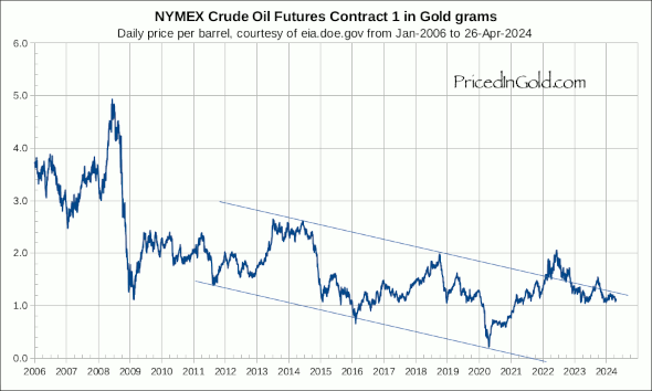
As you can see in the long term chart below, oil is a volatile commodity, with it's price swinging wildly in a range from less than 1 gram per barrel to almost 5 grams per barrel. But this chart also shows that these oscillations are part of a sideways price movement centered around 2.5 grams per barrel. Crude's current price around 1.5 grams is quite a bit below its historical average.
Of course, the fluctuating value of the dollar makes it very hard to gauge whether oil prices themselves are rising or falling… Oil today at 1.5 grams is cheaper than it was in the early 1950s; but if you measure the price in US dollars, you would get the impression that it is about 30 times more expensive today!
Crude Oil, West Texas Intermediate From 1950:

click on the chart to download a pdf

Pings on Crude Oil
Comments on Crude Oil
really very interesting and very impotent blog i benefited a lot thanks for such a nice blog you content of this blog is really fact and your point of this blog really noticeable thanks for that useful info really thanks by heart.
yes a very impotent blog 🙂 ..and I too have benefited so much.. you're the best and I like being here and.. Ok seriously though…where do you get your charts that show data that far back? Interesting to see long term moves over several decades.
You can find lots of interesting data including crude oil prices back to 1986, and gasoline prices back to 1973 at http://www.eia.doe.gov/
great, thank you
Hi Charles, thanks for a truly excellent site. I've just subscribed and am wondering if you'd consider publishing an historical chart of natural gas priced in gold? Many thanks!
Hi again Charles,
I notice that these charts for crude oil are based on West Texas Intermediate (WTI) crude – today between $98 and $99/barrel. But that's the crude gushing into the U.S. from the many huge pipelines from Canada. The rest of the world pays for "Brent" crude, currently almost $120/brl, a solid 20% higher.
What are your thoughts?
Many thanks.
The printed money and also the Oil are loossing power we need to ask what have real Value and act acordingly.
Regards
Milton
Posicionamiento en Buscadores
Howdy, dudey.
Have you ever considered charting Brent crude, priced in gold?
I notice that Brent tracks CRB (as a proxy for "stuff") more closely than WTIC.
Cheers!
DP
We really need an overlay of the chart for price of gold in dollars to see if this is important or not. I suspect not.
Stu, the point is that the dollar is not a constant measure of value, so when you see the price of oil skyrocket in dollars you have to ask yourself "is this important or not?" As you can see by pricing oil in non-dollars (gold) the price of oil is a lot different than it appears. In other words, most of the variance is actually a loss of purchasing power in the dollar rather than a rise in the value of oil.
Dear all
the Golden constant….. is the price of oil has been on average equal 2.1 to 2.35 rams of gold since 1900 or 4 gold schilling!!!!!!!!!!!!!!!!
jaf
see the golden constant
Oil is approching its bottom mesuring in gold.
Against gold, oil is a very good investiment to jump in now.
A declining price of crude oil in terms of gold is an indication that gold is overpriced. Most of the gold in storage today was mined a long time ago. Only a tiny proportion of all gold was mined recently. Oil, on the other hand, is immediately consumed. Little oil is kept in storage. But the cost of extracting oil is rising steadily due to growing geological constraints ("peak oil"). For that reason, the price of crude should be rising in terms of gold.
The declining price of crude oil in terms of gold implies therefore that either 1) gold is overpriced or 2) oil is priced too low.
I don't think any chart has ever made me shit myself but this one just did. Since gold is not overpriced compared to many indicators, this chart implies that oil is priced too low. I am trying to imagine the world where oil goes through the roof as per this chart. I won't be surprised to see oil companies getting nationalised and then even higher inflation in everything around the planet. Scary. Only safety i see here is if oil is going to be compressed like never before in terms of gold.
It's interesting that the price chart for Occidental Petroleum mirrors these charts to a degree. My understanding is that Warren Buffett just invested heavily in Occidental.